User interface differences when switching to Jira and Confluence Cloud
Cloud URL
- Confluence: https://yourdomain.atlassian.net/wiki/home
- Jira: https://yourdomain.atlassian.net/jira/your-work
For admins: To help redirect people still coming to the on-premise instance to your new cloud site URL, you can apply a site-wide banner in the on-premise versions of Jira and Confluence, or you can add an announcement to your online help center in Jira Service Management.
For end-users: If you've bookmarked previous Data Center or Server pages, be sure to update them with the new cloud links.
Jira
General user interface

- Product switcher: Switch to other Atlassian cloud products, like Bitbucket and Confluence, and go to recent projects.
- Jira logo and product name
- Your work: Get an overview of the things you care most about in Jira. Find issues, projects, boards, and queues you’ve visited, work assigned to you, and your starred items.
- Projects, filters, and dashboards: Quickly find and resume work on the things you use most. Your starred items appear at the top of each menu, followed by your recently-visited items.
- People: See the people and teams you work with, and create new teams.
- Plans: See and manage your plans (Premium and Enterprise only).
- Apps: See and manage apps installed on your Jira site.
- Create: Create issues.
- Search: Find issues, projects, boards, queues, filters, and people.
- Notifications, help, Jira settings, and your profile and settings: See what's happening in Jira, get help, and customize Jira’s settings (Jira admins only) and your personal settings.
For more details, see the Jira Cloud navigation page.

In Jira Cloud, searching is site-wide and includes Confluence and linked Bitbucket accounts.
Cloud project view | Jira Data Center project view |
|---|---|
 |  |
Issue view
- Jira Cloud had a UI. Then they got a new one. The legacy view should be deprecated from all sites at this point (although it can still be reverted to manually).
- Jira Data Center and Jira Server haven’t had a lot of changes and look close to the old Jira Cloud UI.
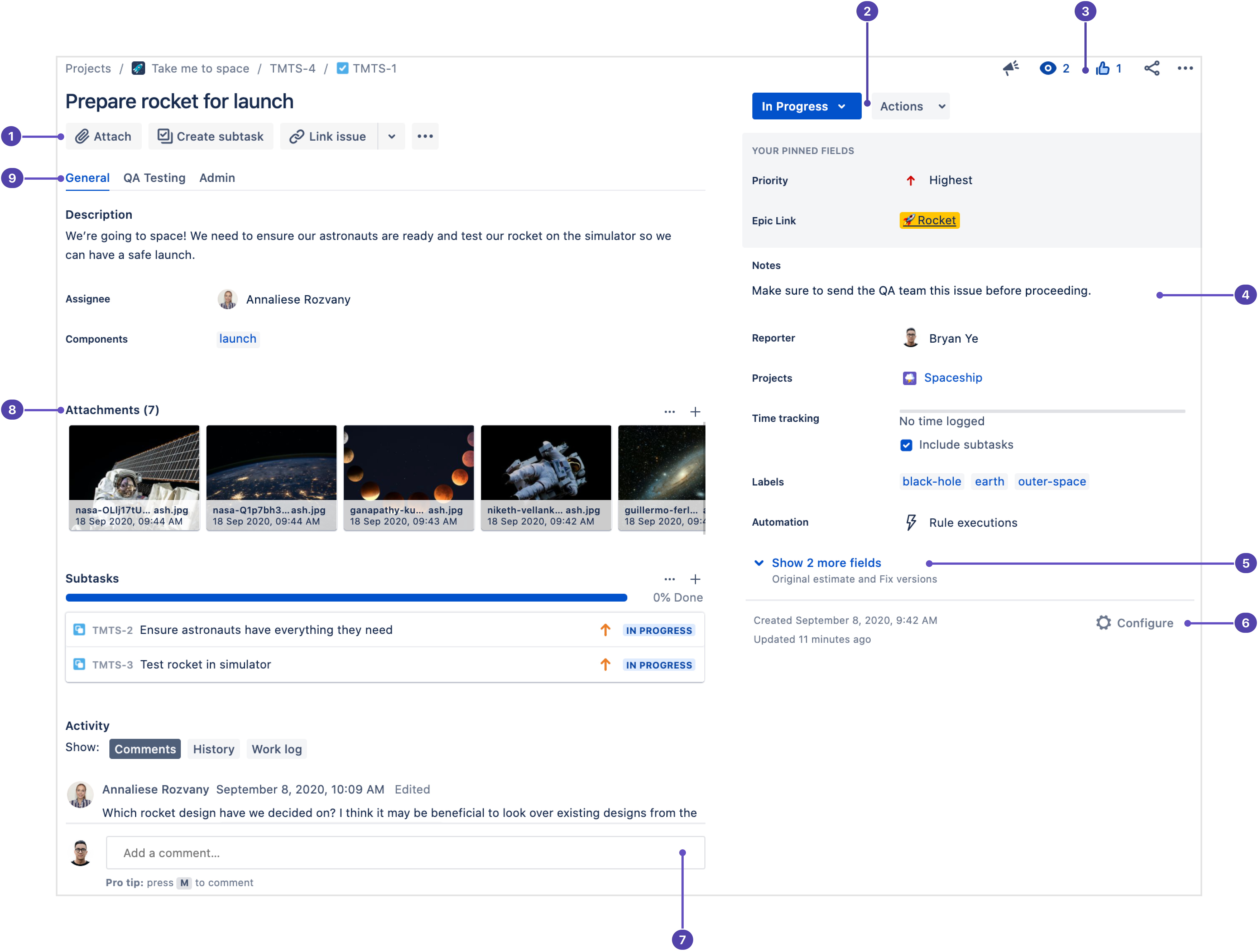
Cloud new issue view | Data Center issue view |
|---|---|
 |  |
Team-managed projects vs company-managed projects
Previously, team-managed projects were known as “next-gen,” and company-managed projects were known as “classic.”
Noteworthy new features
- Automation for Jira is now part of Jira Software Data Center 9.0 and Jira Service Management Data Center 5.0. However, many of the automation features developed for Jira Cloud in recent years are not available in automation for Jira Data Center. These include:
- The ability to run rules as another user
Learn more at Jira Cloud automation support

- Advanced Roadmaps: This may or may not be new depending on whether it was installed in your Jira Data Center or Jira Server instance.
- The cloud version of Advanced Roadmaps doesn’t include the ability to create programs — group of plans — which is available on Jira Data Center. As of Advanced Roadmaps v.3.29, UI differences between the Data Center and cloud versions are minor.
- Basic roadmaps (project-specific): The roadmap is where you can create, manage and visualize your team's epics. Roadmaps are useful for planning large pieces of work several months in advance and planning large groups of stories across different sprints.
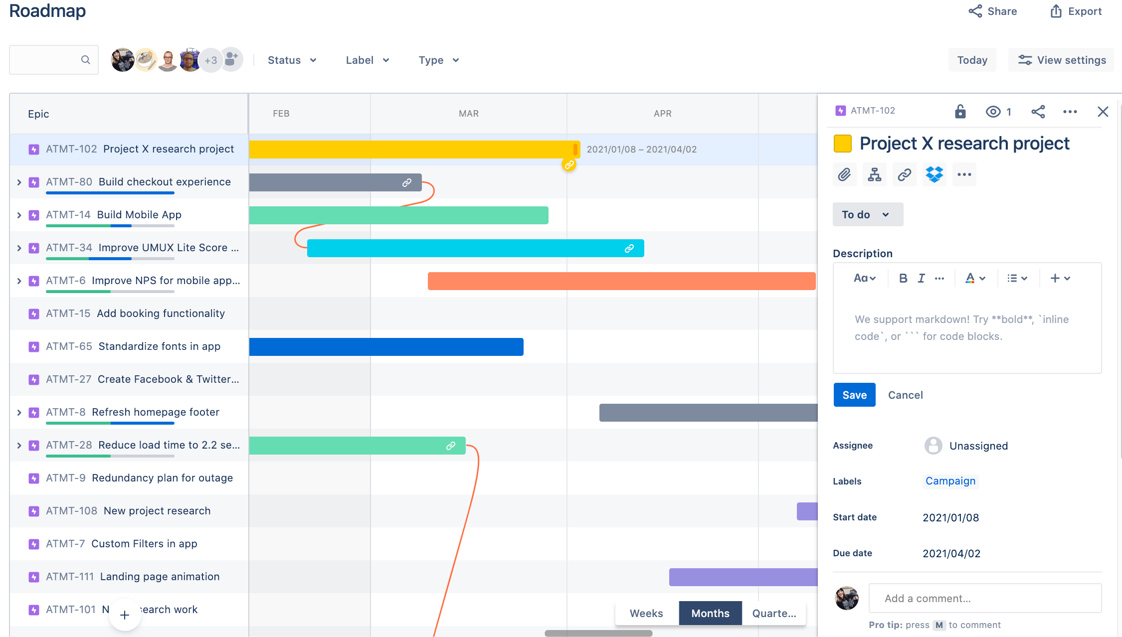
- A wider variety of ready-to-use project templates and, in particular, 23 new work management templates, are bundled in Jira Software Cloud.
- DevOps insights: Includes Jira graph data aggregation, a richer display, and more insight. Teams can create new branches and see associated development work, including:
- Builds
- Pull requests
- Commits
- Deployments
- Branches
- Feature flags
- Custom links
Confluence
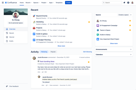
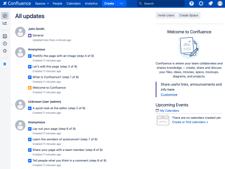
Home Page
- 📄 Resume your work by getting back to your pages faster with recent front and center.
- 👥 Catch up on relevant activity with the new following feed.
- 💡Discover what’s happening across your company with the updated popular feed.
Cloud home | Data Center home |
|---|---|
 |  |
General interface
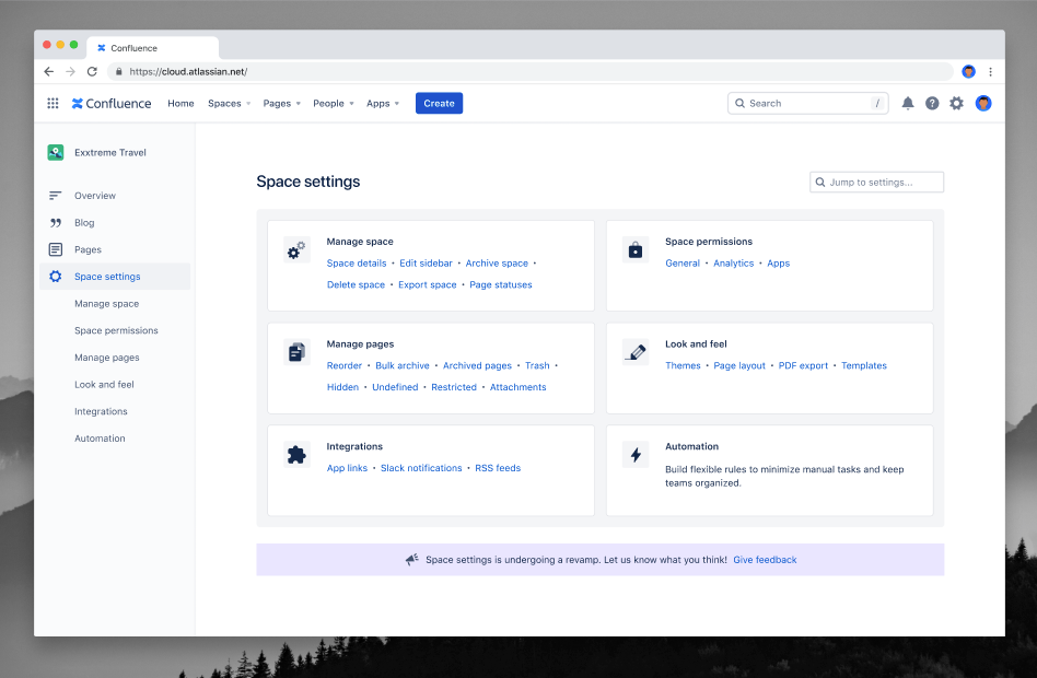
The editor
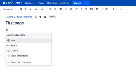
Cloud “fabric" editor | Data center editor |
|---|---|
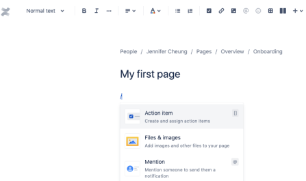 |  |
To stay up-to-date on features that are rolled out to the new editor, keep an eye on the Atlassian blog, where we announce product changes weekly.
- When editing a page prior to collaborative editing, a new personal draft was created for each user and the changes couldn't be seen by other users, as personal drafts are private. Using collaborative editing, a single shared draft is created for each page, and anyone editing the page will see the same draft.
- Personal drafts were represented by a
draftclass, which extendsContentEntityObjectand contains adraftTypefield indicating whether the draft was apageorblogpost. We're deprecating thedraftclass in favor of using the existingpageandblogpostclasses, where acontentStatusfield ofdraftwill indicate the object is a draft.
Before you start a Data Center-to-cloud migration, publish draft pages, because if draft pages contain Jira links or links to other Confluence pages, those links won’t be captured by the link-fixing script Atlassian support runs post-migration.
Autocomplete keyboard shortcuts in the editor
Action | Cloud autocomplete character | Data Center autocomplete character |
|---|---|---|
Tables | / | | |
Links | / | [ |
Images | / | ! |
Macros | / | { |
Headings | # | h1. |
Lists (unordered) | * | * |
Lists (ordered) | 1. | # |
Smart Links
Inline view | Card view | Embed view |
|---|---|---|
 Hyperlink … with style. The Smart Links inline view makes your links pop on the page. You’ll see the logo from the source of the link, so you quickly have information about the type of content. When inserting a link to other Atlassian products, you’ll get even more details, like the status of a Jira ticket. | 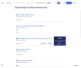 Smart Links card view provides even richer detail. You can see a small preview of the content, plus additional information about it. You’ll also start to see actions added to cards over time. |  What if you never had to break the flow of work (or leave a Confluence page) to interact with content that lives outside of Confluence? Well, Smart Link embed views help you do it. Read and edit a Google Drive document, manipulate your Figma file and more, all within a Confluence page. |
Read more about Smart Links here
Search

Other editor changes
- Inline comments when editing: Whether you are editing a page or viewing it, the process for adding inline comments is the same:
- Highlight the text you want to comment on.
- Select the add comment button that appears above the highlighted text.
- Enter your comment and select save (Ctrl+S or ⌘+S).
- The Data Center editor is full width by default.
- Anchor links are automatically created in cloud for headings. Non-heading links still need to be specified by the anchor macro.
- Adding attachments will have fewer features and a different UI.
- You can't natively link to or render attachments from other pages. You might be used to setting up image or file libraries that can be referred to from other pages, but instead, you can copy and paste the attachment link directly.
- Tables in the cloud are edited and managed differently: In general, it should be a more intuitive experience but it may take some time to adjust.
Other new features in Confluence
- Team calendar (now bundled in Confluence Premium)
- Languages: Atlassian's cloud products and apps are available in two dozen languages, with more on the way. See our manage your language preferences page for a complete list of the languages that are currently available.
The mobile apps for Jira Software and Confluence Cloud are different. If you currently use the Data Center mobile apps for these products, you’ll need to install new apps:
-
Jira mobile: the official Jira app from Atlassian
-
Confluence mobile for iPhone and Android from Atlassian
Atlassian Access also comes with mobile device management (MDM) for Atlassian mobile apps.
Additional resources
Link | Description |
|---|---|
Watch the blog to get regular updates on what is changing in cloud | |
Cloud Adoption Toolkit can be used to build and execute a successful adoption and change management plan. Resources include: Atlassian’s guide to change management and adoption Email templates for introducing Atlassian cloud products Setting your users up for success with Atlassian cloud products: admin guide Quick start guides for Jira Software and Confluence Cloud: user guide Ideas to explore: Share regular updates with users about new features, tips and tricks, etc. in Confluence blog post Quarterly user feedback surveys | |
Free self-paced courses that will help your users get up and running in Confluence and Jira in just 90 minutes | |
Paid courses for leveling up admin skills | |
Administration manual | |
Organization administration course | |
A brief overview of the basics | |
Getting started guides: | For admins who are new to the cloud landscape |
Both live and on-demand, hour-long demos for main Atlassian products | |
Cloud release notes and news. | |
YouTube playlist which are updated frequently to share demos of product features. | |
Watch on-demand webinars as Partha Kamal, our Head Enterprise Product, and Dave Meyer, Sr. Group Product Manager for Enterprise Cloud, walk through the latest features we’ve added to Atlassian Cloud products within the last two quarters as well as the exciting features on our roadmap - including data residency, industry compliance, cloud user limits, and more. | |
The Atlassian Enterprise Group's mission is to encourage and foster discussions and thought leadership with the Atlassian Community around a broad spectrum of enterprise-related issues, best practices, use cases, workflows, and any other challenges unique to the space. This group is a place where customers and Atlassians can come together to create feedback loops and have open, honest discussions about Atlassian product plans, ideas, wins, problems, and quality. |
Was this content helpful?
Connect, share, or get additional help
Atlassian Community